
While nonprobability-based surveys are a great way to engage a lot of residents, it can be hard to know whether you’re reaching a representative sample of your community. The demographics of those who respond to a survey are not always aligned with the total population: some demographic groups (such as young adults and renters) often respond at lower rates, which may cause them to be underrepresented in survey results. For this reason, Polco’s Engage module automatically provides representivity visualizations for all nonprobability-based surveys.
Why use these representivity visualizations?
These graphs can help you:
- identify which groups are responding at lower levels (proportionate to your community),
- see where additional outreach may be needed,
- adjust your communication and outreach efforts accordingly, and
- understand how representative your end results are.
How to use Polco’s representivity graphs
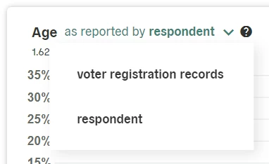
Because representivity graphs rely on participants’ demographic data, you’ll need to include Polco’s pre-built demographic questions about age, race, and gender on your surveys. While some respondent demographic data may come from voter registration records, the vast majority is gathered through user-reported answers to these specific demographic questions. Including these questions on your surveys will minimize the percentage of unknown respondent data and help you use these visualizations most effectively.
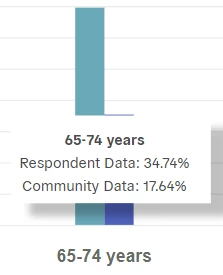
Reading your representivity graphs
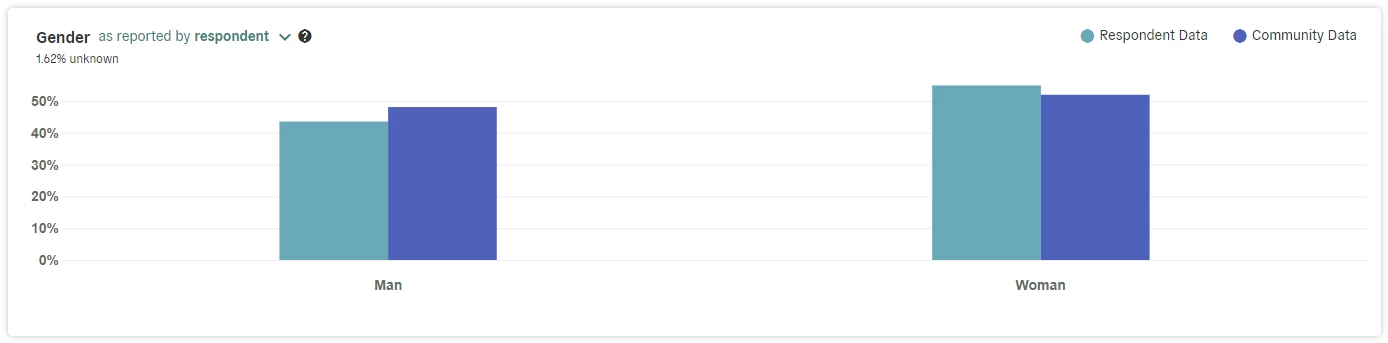
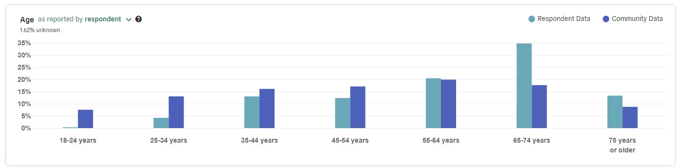
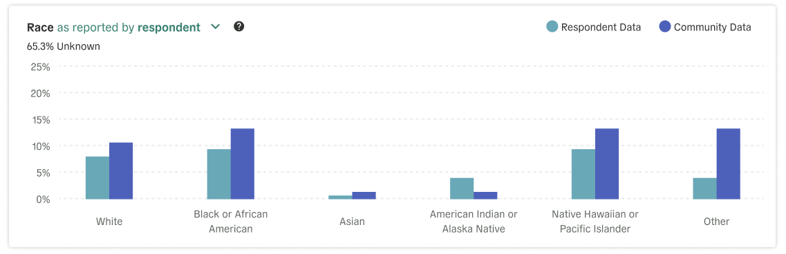
On the Participation tab of an active survey, you’ll see bar graphs illustrating representation levels for certain demographics (e.g., gender, age, and race) for both survey participants and the entire community.
You can use the dropdown menu on each graph to switch between respondent-reported data and voter registration records.
Hovering your cursor over any given bar on the graph will show the specific percentages for each demographic comparison.
Understanding your data
How do we use this information about representation? Why does it matter? These side-by-side comparisons allow you to easily see which audiences your survey is successfully reaching and which others may benefit from additional, targeted outreach to increase participation. Bringing more voices into the conversation helps gather complete data that represents your entire community! If additional outreach isn’t an option, these graphs also help you consider the accuracy of your results (based on the representativeness of your respondents) and whether decisions can be made in confidence.
In addition, Polco also offers an automatic weighting option to balance any discrepancies you might see in those graphs and increase the overall representivity of your data. Together, these tools help ensure that your existing and future survey efforts are as representative of your larger community as possible.